
- Typography
- Readability
- Line Length
Readability Is a Responsibility
3 min read · No. 44
If people cannot read it comfortably, it does not matter how good it looks. Line length, leading and size are where respect for readers begins.
21 posts
Design principles, UI/UX, and visual content
Page 1 of 3. Latest: November 2, 2026. Oldest: January 5, 2026.
3 min read · No. 44
If people cannot read it comfortably, it does not matter how good it looks. Line length, leading and size are where respect for readers begins.

2 min read · No. 41
Great typography does not ask to be admired. It asks to be read. Every typeface, size, and space should serve the words and the person reading them.

2 min read · No. 39
White space is not what is left over after the design is done. It is an active element that guides the eye, creates hierarchy, and lets the message breathe.

2 min read · No. 35
We design on large monitors with precise cursors. Our users live with thumbs, motion, and distraction. The best mobile interface fits the hand holding it.
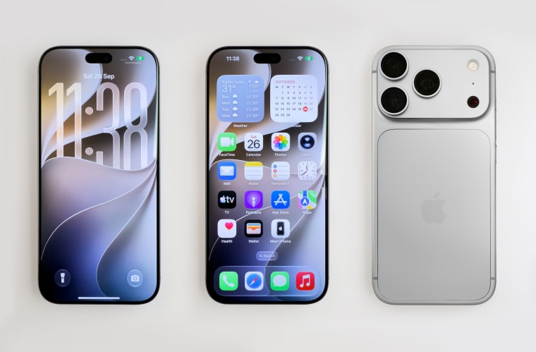
3 min read · No. 33
Mobile first is not about screen sizes. It is about deciding what matters most, and that decision is the real design work.

2 min read · No. 29
New users do not want a manual. They want a first win. Great onboarding feels less like instruction and more like hospitality.

2 min read · No. 27
People live inside the small moments of a product. A toggle, a tap, a gentle vibration. Get those details right and the whole experience feels alive.

2 min read · No. 24
Accessibility is not something you add at the end. It is the ground everything else stands on, and when you design for the edges, everyone benefits.

3 min read · No. 21
People notice colors and typography. What decides whether they find what they came for is the structure underneath. That is information architecture.