
- UX
- User Experience
- Error Messages
Good Error Messages Are a Form of Respect
3 min read · No. 18
An error message is a conversation with a person at their most frustrated moment. Make it clear, make it helpful, and never make them feel small.
21 posts
Design principles, UI/UX, and visual content
Page 2 of 3. Latest: November 2, 2026. Oldest: January 5, 2026.
3 min read · No. 18
An error message is a conversation with a person at their most frustrated moment. Make it clear, make it helpful, and never make them feel small.

3 min read · No. 14
Every option you add asks your users to stop and decide. Fewer decisions at the right moment create faster, calmer, more confident experiences.

2 min read · No. 12
You can design with confidence, but until real users interact with your work, you are still making assumptions. Usability testing turns assumptions into clarity.
2 min read · No. 11
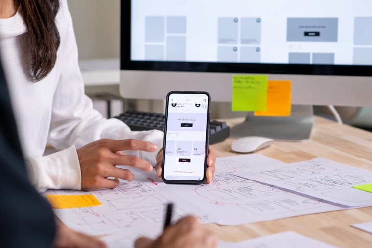
Waiting until the end to get feedback is one of the most expensive mistakes in design. The earlier you invite it in, the faster your work improves.

2 min read · No. 8
Great design does not start with color palettes or wireframes. It starts with questions. Research transforms assumptions into insight and opinion into direction.

2 min read · No. 7
Good design is not decoration. It is not trend chasing. It is thoughtful, useful, honest, and built to last. At its best, it quietly improves the world around us.
3 min read · No. 6
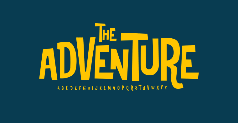
Before images speak and before layouts guide, typography sets the tone. The typeface you choose shapes emotion, clarity, and perception long before the user reads a single sentence.

3 min read · No. 5
Symmetry feels safe. Grids feel structured. But sometimes the most compelling designs emerge when we step outside perfect alignment and embrace controlled imbalance.

3 min read · No. 4
The best interfaces feel obvious. When users have to stop and think about what to do next, the design has already failed. Simplicity is not basic. It is intentional.